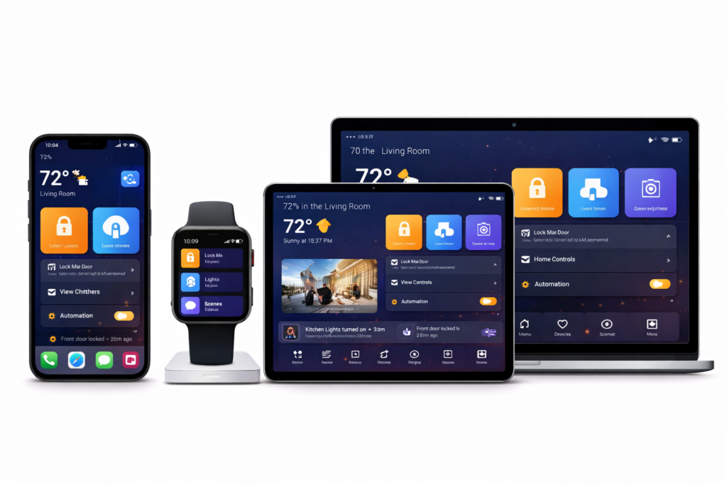
Designing an app that works across devices is one thing. Designing an app that actually feels good on phones, tablets, and foldables is much harder.
In 2026, users don’t just expect apps to resize. They expect them to adapt — to space, posture, input method, and context. When that doesn’t happen, the app feels awkward, even if it technically runs fine.
Multi-device UX isn’t about perfection on every screen. It’s about making the app feel natural wherever it’s used.
Here’s how teams are approaching that problem today — and what actually matters.
Start by designing for ranges, not devices
One of the biggest mistakes in multi-device design is thinking in terms of specific hardware:
- “Phone layout”
- “Tablet layout”
- “Foldable layout”
That mindset breaks down quickly.
Instead, modern apps are designed around size ranges:
- Compact
- Medium
- Expanded
Each range defines how content is arranged, not how big the screen is. A foldable in portrait might behave like a phone. The same device unfolded might behave like a tablet.
This approach:
- Scales better to future devices
- Reduces design debt
- Avoids brittle, device-specific logic
👉 Material Design 3 adaptive layout guidance
Layout flexibility beats clever UI tricks
When apps feel bad on large or flexible screens, it’s usually because the layout was never meant to stretch.
Common problems include:
- Overly wide text lines
- Empty space with no purpose
- Floating controls in awkward positions
Good multi-device layouts use space intentionally:
- Columns instead of full-width text
- Side-by-side views instead of stacked screens
- Navigation that moves, not duplicates
If nothing benefits from extra space, the app probably shouldn’t expand that way.
Foldables force honest design decisions
Foldables expose weak design faster than any other form factor.
When a device folds or unfolds:
- Navigation suddenly has room to move
- Content density can increase
- Context can change mid-session
The best experiences:
- Preserve user state
- Rearrange content calmly
- Avoid dramatic UI jumps
👉 Android large-screen and foldable guidelines
Input changes how apps should behave
Screen size gets most of the attention, but input method often matters more.
On larger devices, users expect:
- Keyboard navigation
- Focusable UI
- Hover and precision interactions
Apps designed only for touch often feel clumsy with a keyboard and mouse. Supporting multiple input types doesn’t mean duplicating features — it means respecting intent.
Navigation should evolve with space
Navigation is the clearest signal of whether an app is truly multi-device.
- Small screens: bottom navigation or drawers
- Large screens: side navigation, fewer mode switches
Keeping the same navigation everywhere usually wastes space or adds friction.
Good navigation systems:
- Change position as space increases
- Keep destinations consistent
- Avoid duplicate controls
Motion and transitions matter
On phones, layout changes are easy to hide. On tablets and foldables, they’re obvious.
Thoughtful motion:
- Explains what changed
- Preserves orientation
- Makes resizing feel intentional
This doesn’t require flashy animations — just continuity.
Test for feeling, not just correctness
Apps can resize perfectly and still feel bad.
Good multi-device testing includes:
- Resizing mid-task
- Multi-window scenarios
- Keyboard-only navigation
- Long usage sessions
If it feels tiring or awkward in testing, users will notice.
Don’t aim for identical experiences
Great apps feel consistent, not identical.
That means:
- Same mental model
- Same core actions
- Different presentation
Trying to force sameness usually hurts at least one device.
External inspiration worth studying
- Material Design 3 adaptive UI guidelines
- Android large-screen app quality guidelines
- Apple Human Interface Guidelines for iPad and multitasking
Final thoughts
Designing apps that feel good across phones, tablets, and foldables isn’t about chasing form factors. It’s about respecting context.
When apps adapt calmly, use space intentionally, and respond to how people actually interact, users stop thinking about devices altogether.
They just enjoy using the app — and that’s the goal.